
Train Everywhere
Train Everywhere is an online mind and body fitness platform that makes whole-person wellness development accessible and achievable to anyone, anywhere. Founders Joe and Britt believe that there’s a connection between the mind and the body; that physical, mental, spiritual, and relational health all go hand-in-hand, and when one area suffers, the whole person does. Many self-betterment programs focus on one or the other; Train Everywhere seeks to provide everything in one place: guided mental and emotional development as well as training for physical toughness, strength, endurance, and flexibility, and access to reputable fitness products. The platform’s content targets busy 20 to 40-year-old individuals with some fitness experience who need flexible training options that can be done with minimal equipment. Founded by a NAVY Veteran metalhead and a surgical tech yoga enthusiast, the dynamic duo brings a unique flair to their clientele’s user experience.

While Train Everywhere was in its early development stages, Joe and Britt came to me in need of a portal for people to acquire membership, access video and blog-type exercise content, and interact with products. Namely, they needed a website—one that would be extremely well-organized, high-functioning, and accessible from various devices, with login and subscription capabilities, an easy-to-use payment portal, social media integration, high-speed video streaming capacity, and an aesthetically pleasing interface.
In addition, for Train Everywhere to reach their goal of becoming the leading online fitness platform out there, they would need to establish a following. This required that their website and all other promotional materials have a recognizable and enticing brand image that accurately communicates the company’s purpose and personality.
Fabelle Creative recommended that Train Everywhere invest in a full startup branding package and responsive website design. The first step of this process was to dig deeper into who they wanted to be as a company. Through a series of questionnaires, I gathered what I needed to know about them, and wrote a set of core beliefs and brand messaging. This then acted as a blueprint as we developed a logo, brand guidelines, and website.

Train Everywhere’s Core Beliefs
The human person is 10x more capable than they think they are.
We are all capable of greatness. The projected reality is already real; mindset is the biggest differentiator between the highly successful and the average. Any goal imaginable—even the most seemingly impossible—can be reached if it’s viewed as inevitable.
The body, mind, and spirit are interconnected.
The human person is composed of many factors, but all have an impact on each other. When we improve one area, or if one area suffers, the whole person does, too. Train Everywhere approaches the human person in wholeness, addressing physical strength, flexibility, and endurance, along with mental, relational, and habitual disciplines.
Failing to plan is planning to fail.
While every person is capable of 10x more than they think, few get there because they lack a road map. It takes 21 days to form a new habit. By placing ourselves within structures of consistency and accountability, we can achieve anything.
Train Everywhere’s Core Values
Interconnected Wholeness
Resilient Discipline
Courageous Perseverance
Intellectual Growth
Natural Harmony
Authentic Transparency

Branding
The Logo
Deciding on logo imagery was tricky, as there were a lot of things we wanted to communicate about Train Everywhere with the icon: a balance between masculine and feminine, a dance of disciplined strength of the body and peaceful harmony of the spirit, nature-oriented with a tip of the hat to the online essence of the platform. After many ideas and attempts, we landed on a lettermark that combines the T and the E of Train Everywhere, where the T resembles the Tiwaz rune of Elder Futhark—a symbol of honor, justice, and leadership that held personal significance to the founders and touched on the spiritual element of their program. It also looks like an arrow pointing upwards, just as Train Everywhere participants are always growing, moving up towards their goals and reaching their greatest potential. Its pointed base implies a groundedness, and the letters’ mix of sharp edges and smooth curves strike a balance between grit and grace. Collectively, the T and Es resemble a pine tree to point to Train Everywhere’s value of natural harmony.
Colors, Fonts, & Style
Green is a color that symbolizes nature, life, growth, and newness, and lands on the more harmonious spectrum of colors like purple and blue. This particular shade of brighter, almost lime green leans into yellow just enough to add a sense of urgency, energy, and power, familiar to people who own any sort of fitness products and clothes, which often come in similarly bold tones.
The style of the brand and website is punchy, modern, and dark—a mixture that reminds the viewer of fitness sites, online products, and depth of thought and feeling. The font pairing is an edgy grunge script with an all-caps sans serif, which keeps things bold and empowering, yet clean and professional. It is moody, yet positive; intense, yet calm; exciting, yet reflective; intrepid, yet intellectual.

“moody, yet positive; intense, yet calm; exciting, yet reflective; intrepid, yet intellectual.”
Photography
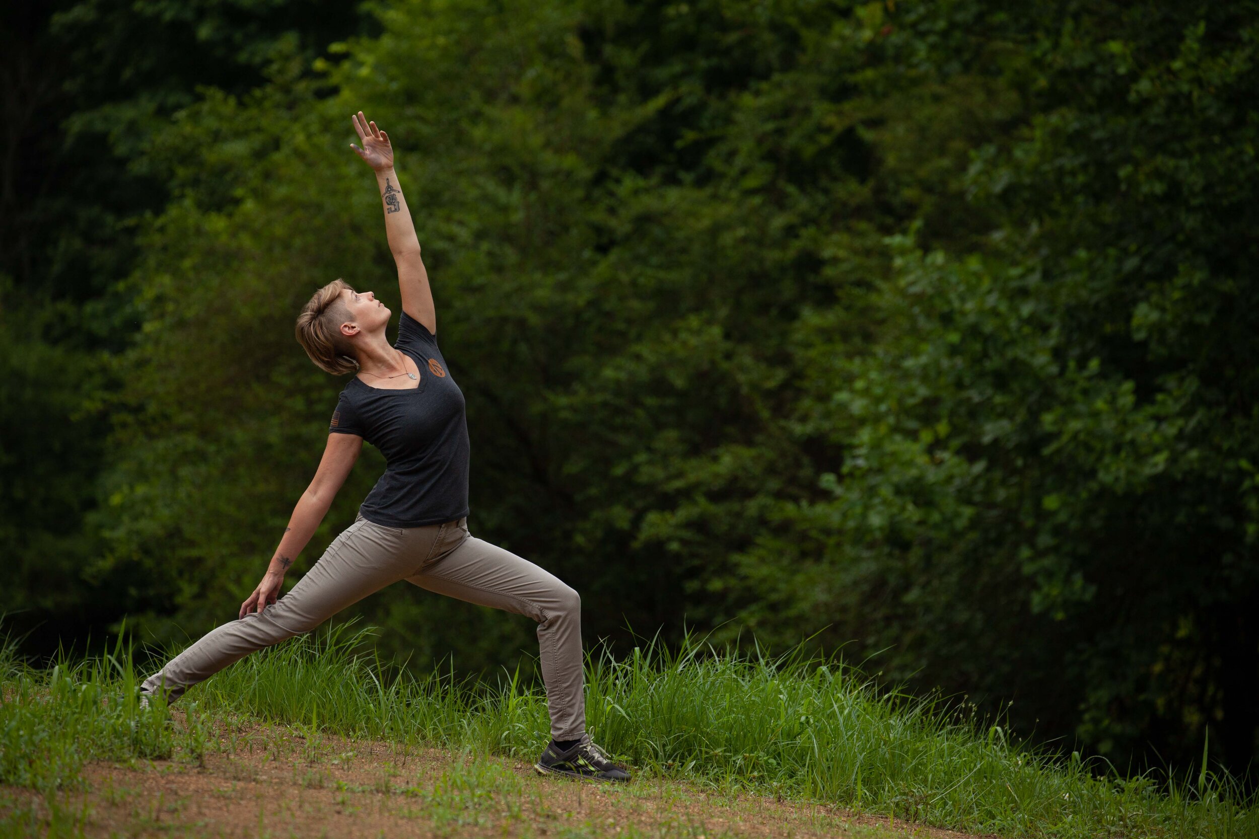
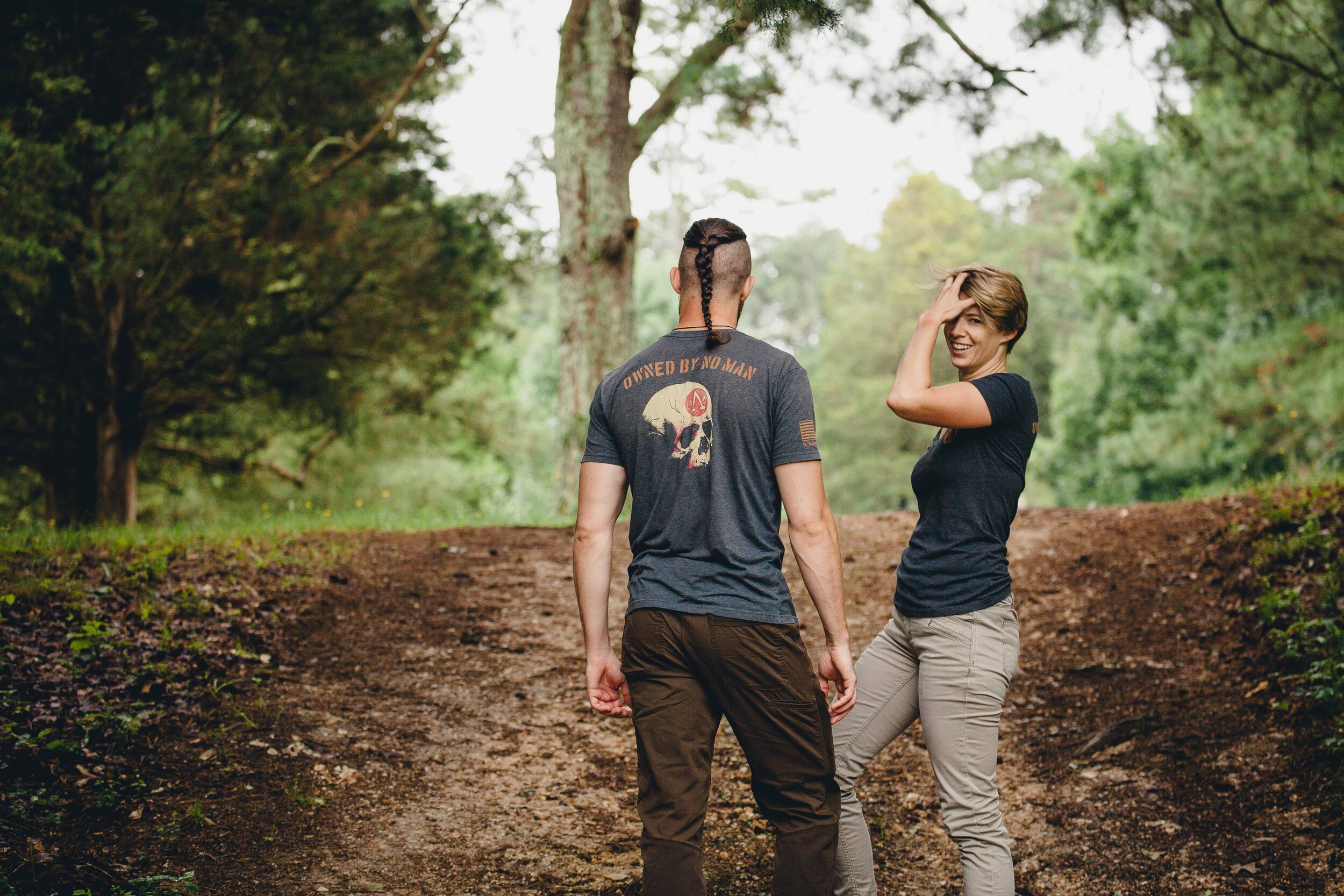
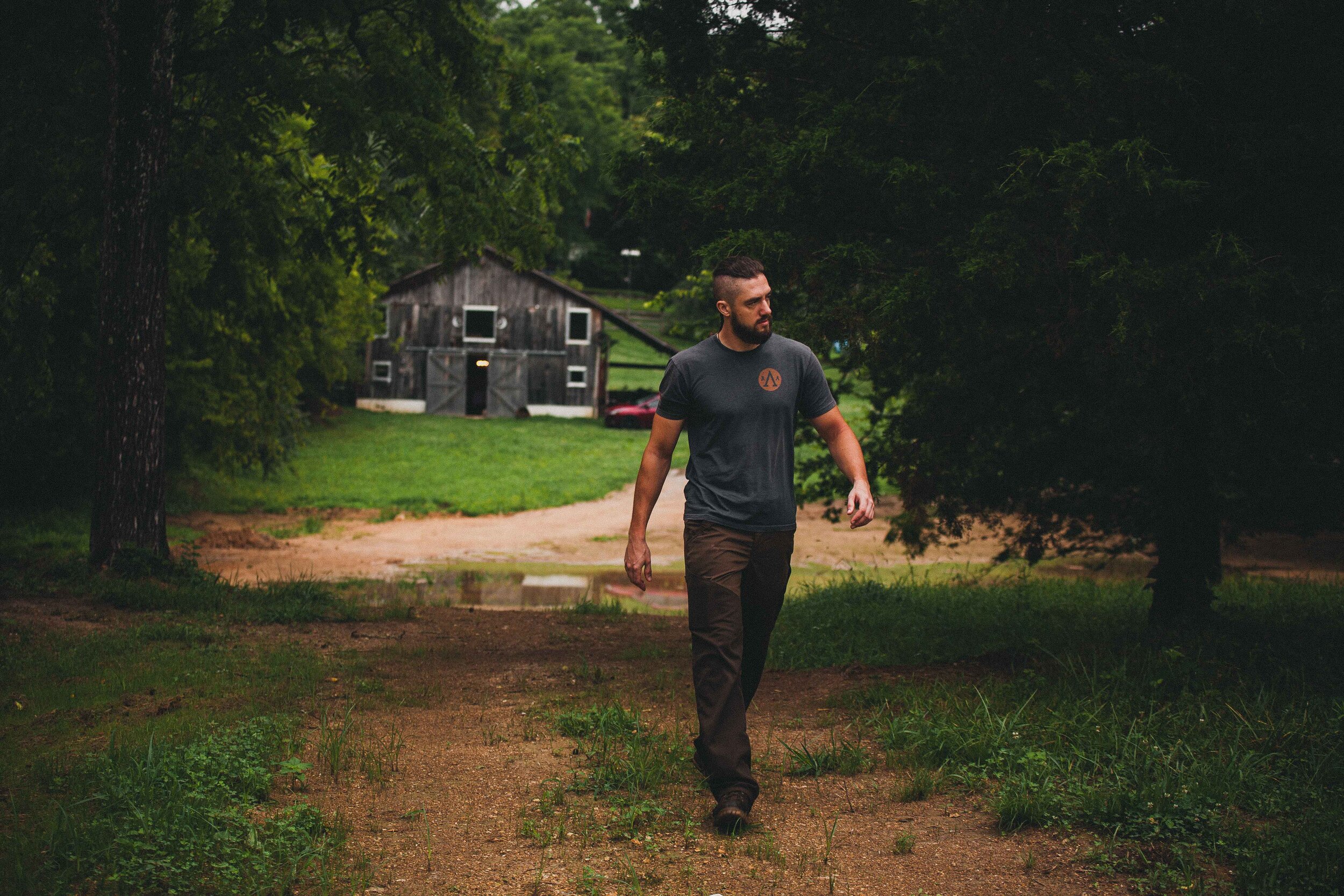
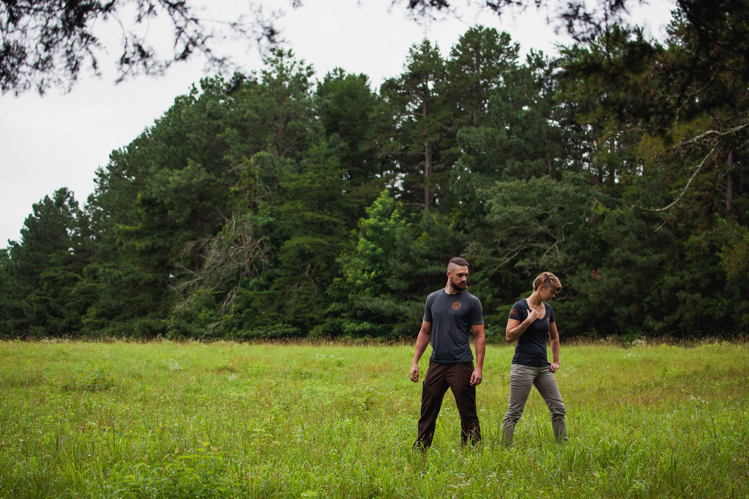
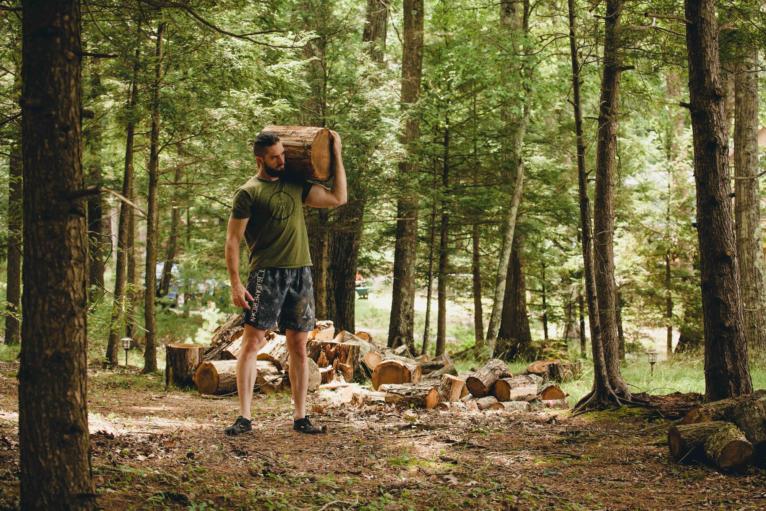
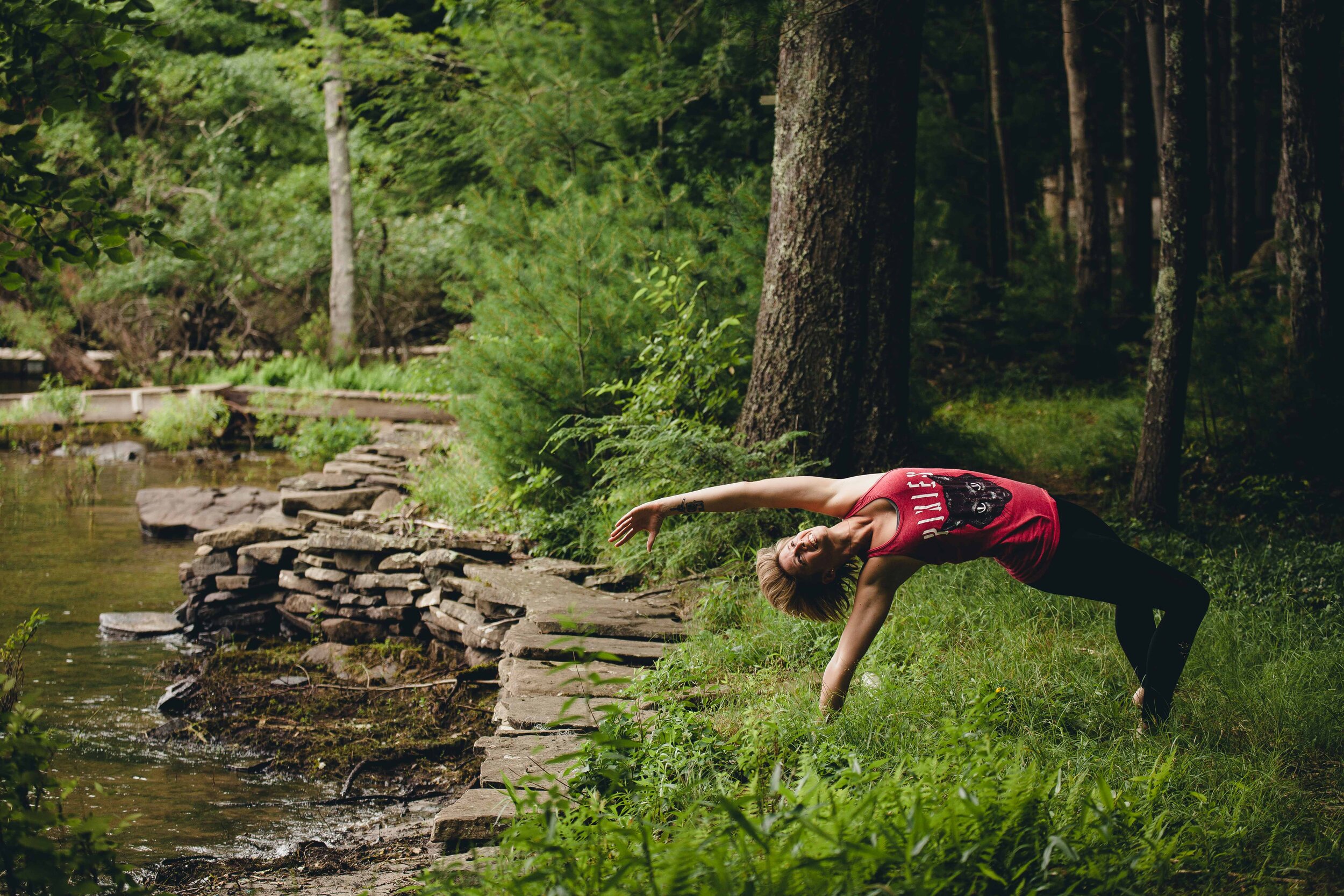
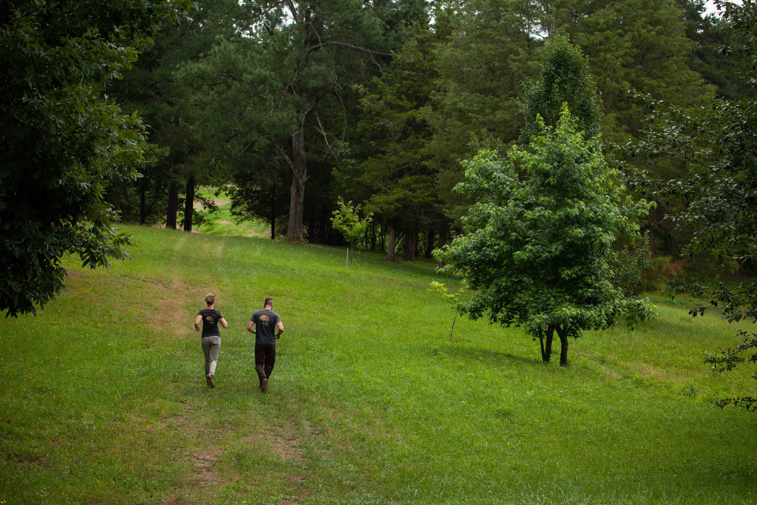
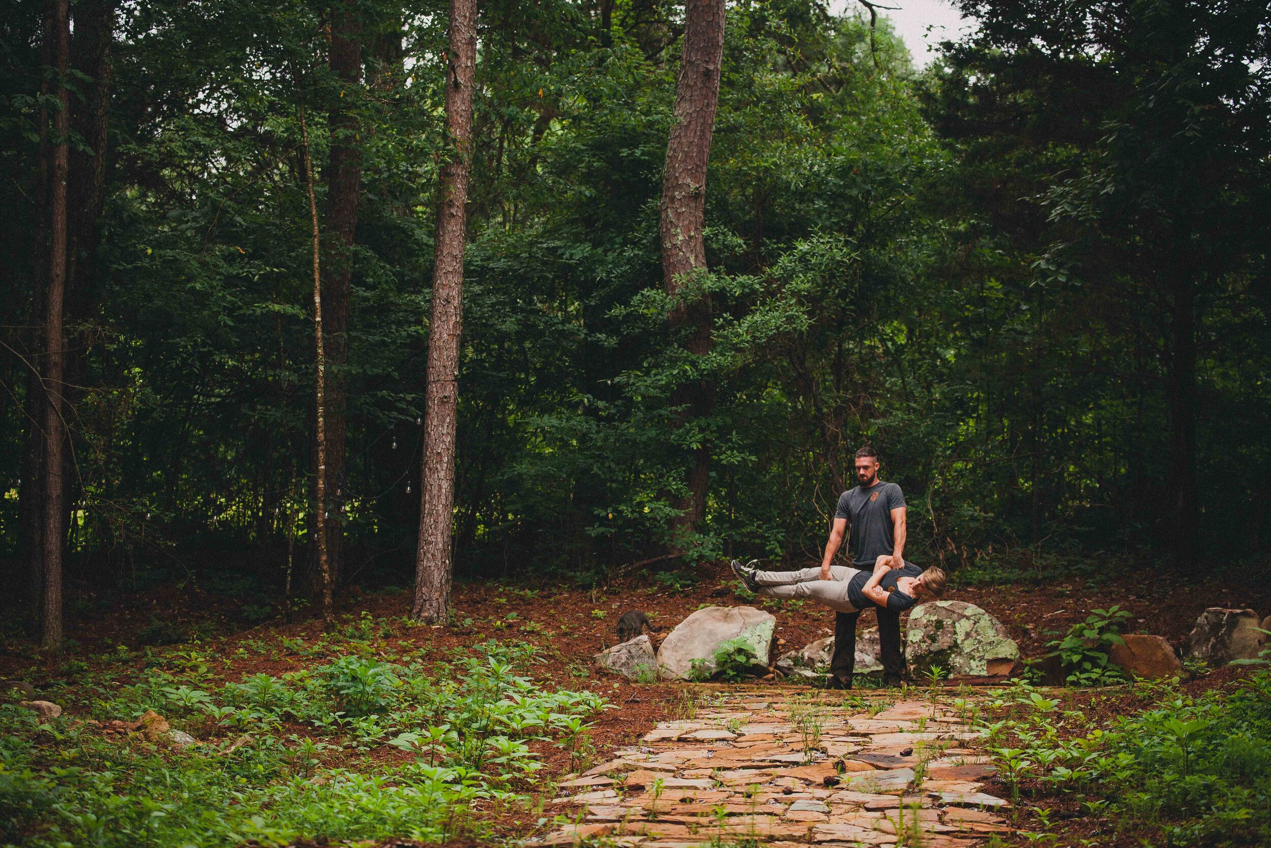
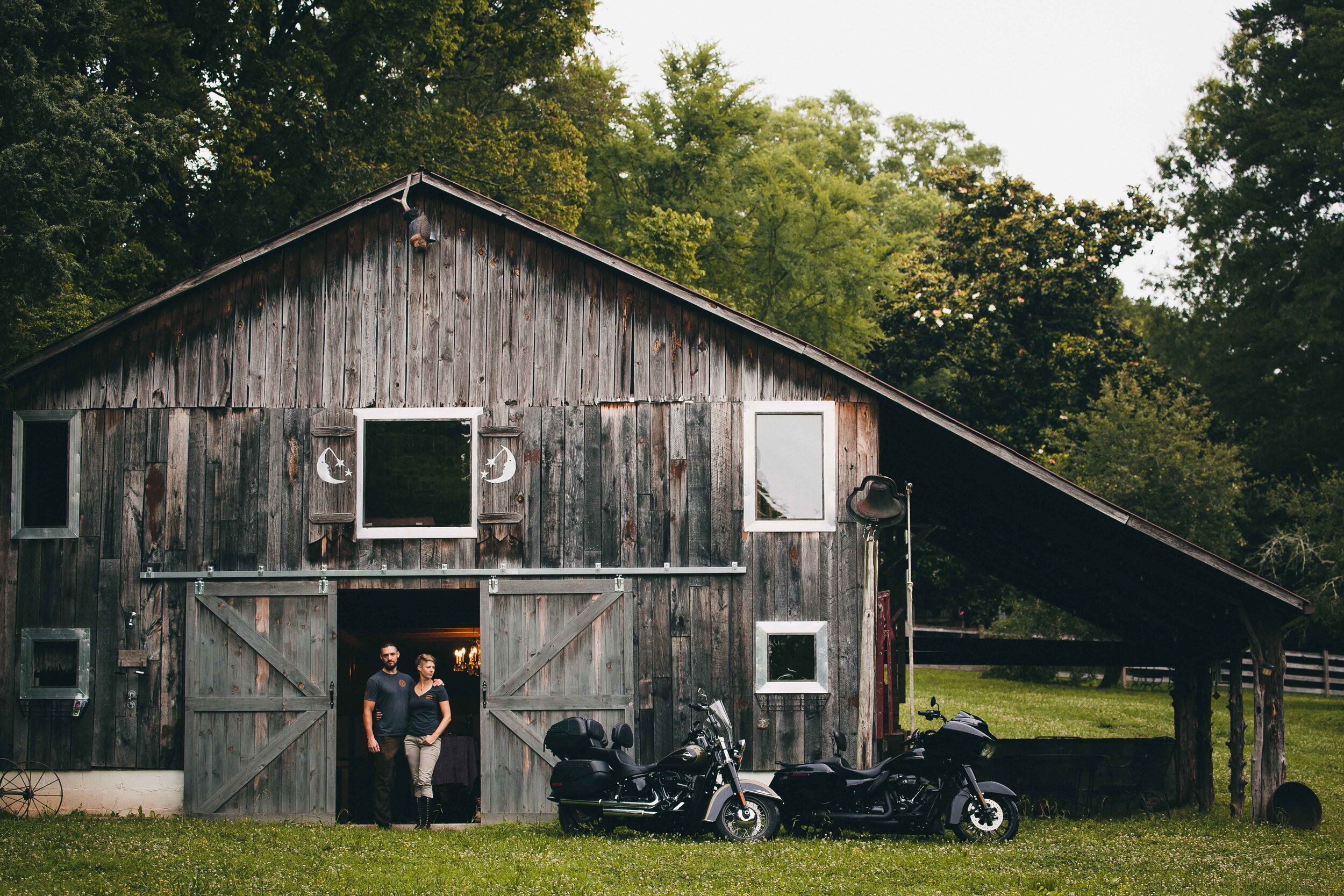
Most stock imagery surrounding yoga, fitness, and mindfulness, are very one-sided: a yogi girl in a class, a meathead in a gym, or an intellectual reading, for example. To avoid stereotypes and present Train Everywhere as a 3-in-1 wellness solution that can be done by anyone anywhere, we took professional photos of founders Joe and Britt out in nature. These add a consistent look and personal touch to the website.


The Website
Train Everywhere’s website was particularly challenging because it required protected video content, where certain pages on the site would be hidden, accessible only to those with a corresponding subscription. Besides a recent bilingual tourism website I made—VIP Concierge Jacó—this was one of the most complicated sites I have created thus far. It features a homepage that acts as a sales pitch for the program, and a member dashboard where existing users can access all their content. The main navigation caters to new viewers, while the submenu found in the dashboard makes it easy for existing members to access premium content. Visitors can sign up for free to access a limited library of videos. Throughout the free pages, I added seamless links to premium content that, when clicked, trigger a promotional popup with an option to upgrade. The idea was to give free users a taste, then show them what they’re missing out on. Each video is viewable in a blog post that is tagged and categorized by three main areas: workouts, yoga flows, and mental development. Full courses are also available for purchase or are included for premium members, who have access to additional content like recipes and a community directory. Creating this website in my preferred platform, Squarespace, required a lot of extra coding and third-party extensions, as Squarespace is not set up for this kind of website model. The end result, however, satisfied my client and greatly impressed beta testers. I wish Joe and Britt every success as they continue to guide others in health of mind and body!

Business Cards
The first editorial project Joe and Britt needed to apply their branding to was business cards to hand out while pitching Train Everywhere to individuals in their community. They returned to me for this project as well.

Ready to take your initiative to the next level?
Contact me today to get started.