
Life Teen Bible Redesign
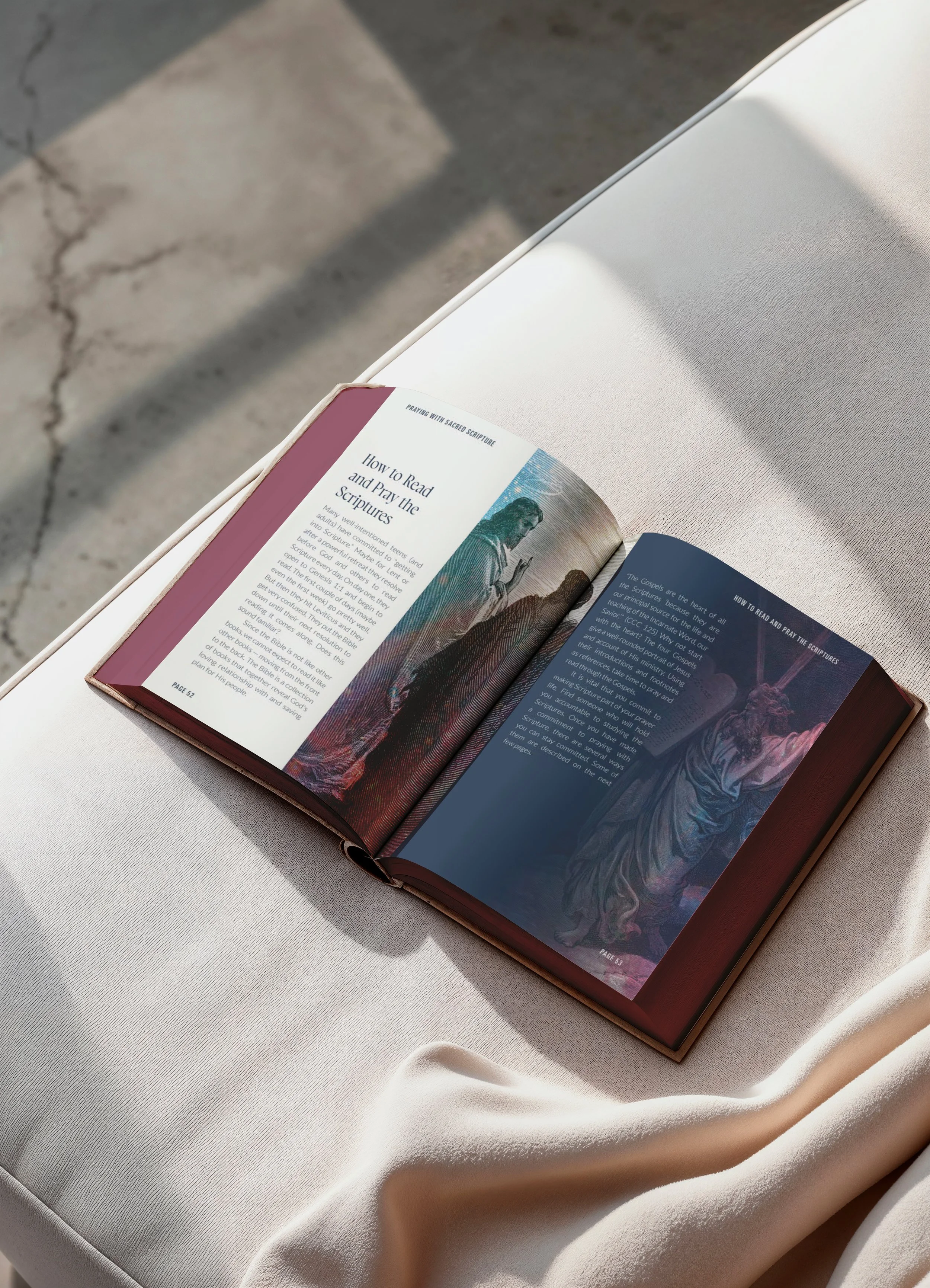
The Bible presents the Good News of Jesus Christ and invites those willing to receive it into a deep relationship with him. What makes the Life Teen Catholic Teen Bible unique is that it expands on the text of the New American Bible with—as stated on their website: “stunning artwork for deeper meditation, tips for navigating the Bible and hearing God speak, 15 micro studies, brief overviews of all 73 books of the Bible, a thematic concordance and Scripture verses for memorization, and guides for Lectio Divina, apologetics, and praying the Rosary with Scripture.”
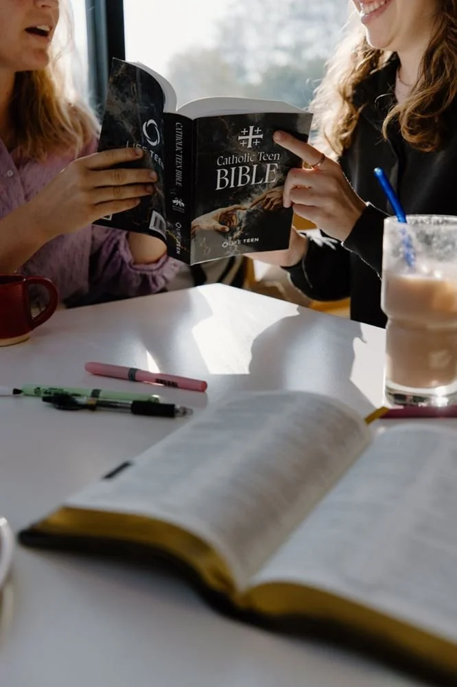
Sherwood Fellows was approached by Life Teen to redesign the newest iteration of their Teen Bible, and collaborated with Fabelle Creative to design its cover, define the visual style of its interior, and create the foundations for the book’s page layouts.
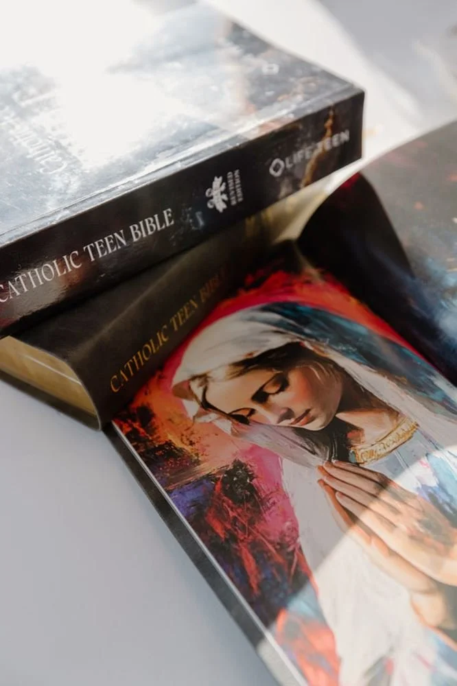
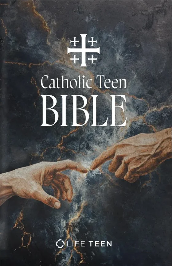
Battle of Light
The theme given to Fabelle Creative to guide the creative process was “Battle of Light,” which explored the concepts of spiritual warfare: the struggle between good and evil, light and darkness. The theme is anchored by stark contrast: deep blues against luminous highlights create a visual binary that immediately signals a spiritual conflict. This high-contrast foundation makes every element read as part of a larger moral drama, where the absence or presence of light becomes a narrative device. By leaning into opposites, the design clarifies stakes and directs attention to areas where illumination challenges shadow, reinforcing the thematic tension.
Intense lighting effects amplify that tension, with radiant beams, glowing washes, and surreal color overlays that feel almost cinematic. Light is treated as an active force—piercing, cleansing, and revealing—while shadow pushes back as a tangible resistance. This not only dramatizes moments of triumph but also heightens the surreal quality of the scenes, turning ordinary representation into something more mystical.
Imagery fuses classical Catholic art with contemporary abstraction. The reimagined religious etchings of Gustave Dore keeps the weight and familiarity of ancient narratives while introducing modern visual disruption: cut fragments, layered textures, and unexpected color fields that repaint biblical scenes as ongoing, urgent battles. This blend preserves reverence but invites reinterpretation, making the spiritual struggle feel present and relevant.
Typography and color sharpen the message. Bold, modern fonts juxtaposed against archaic text conveys the ever ancient, ever new battle cry of Scripture. The color palette introduces surreal neon blues, reds, and pinks that energize compositions and guide meditative reading. Together, these elements maintain the central conflict between light and dark while adding contemporary vitality that keeps the theme visually compelling and emotionally charged.